


A definitive guide to producing, using, and improving a risk heat map at your organization.
A good risk assessment is an important part of the process of putting together a solid internal audit plan. But gathering risk information from throughout the company and organizing it into manageable and actionable material can be a daunting task. Creating a risk heat map can help.
Conducting a risk assessment, either as part of a full enterprise risk management process (ERM) or through a more narrowly focused internal control process, is a critical step to help keep management focused on the key risks that could impact the company. A heat map—a visualization tool to help organize, define, and quickly communicate these key risks—is an indispensable tool in any risk management toolbox and can help cut through the complexity.
Indeed, risk heat maps are a common part of an ERM approach to risk management. The Committee of Sponsoring Organizations’ (COSO) ERM guide, Enterprise Risk Management—Integrated Framework, promotes the use of a risk matrix or heat map to focus management’s attention on the most important threats and opportunities and to lay the groundwork for risk responses.
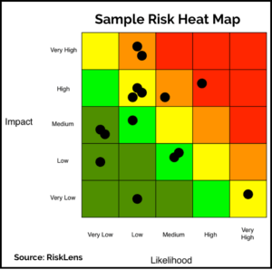
A heat map is a two-dimensional representation of data in which values are typically represented by colors (often red, green, and yellow) and can range in complexity from simple (for example, showing qualitative risks only) to more complex (including qualitative and quantitative risks). In the risk assessment process, visualization of risks using a heat map presents a concise, big-picture view of the full risk landscape to discuss while making decisions about the likelihood and impact of risks within the company. (It’s important to note that a full risk identification and assessment process is generally required before creating a heat map and those steps are not addressed here.)
An Important Risk Management Tool
Risk expert Norman Marks writes in his book, World Class Risk Management, that a heat map can be an important tool to communicate risk within an organization. “A heat map is very effective in communicating which risks rate highest when you consider their potential impact and the likelihood of that impact,” he writes. “The reader is naturally drawn to the top right quadrant (high significance and high likelihood), while items in other quadrants receive less attention.” Let me note here that Marks has some cautions about the use of risk maps that we will get to in a moment.
To make use of a risk map, it’s important for the organization to create a common language around discussions of risk. Terms like “ potential impact” and “likelihood” need to be defined and used throughout the organization and in the design of the heat map so that everyone is on the same page on discussions of risk. It also requires a common understanding of the risk appetite of the organization.
Organizations use a variety of ways to identify entity-wide risks, including surveys, workshops, interviews with business unit managers, risk factors disclosed in financial reports, industry literature, and many others. When the entity-wide risks are identified then each risk is assessed for potential impact, sometimes called “severity” and likelihood of occurring.
Assigning the impact and likelihood scores is easily the most difficult part of the risk-mapping process and much thought and deliberation should go into it. While internal audit can play an important part of this risk scoring, the process should seek major input from the business unit managers, risk management function, and elsewhere.
Plotting the Risks
A typical risk heat map will show risks plotted on a graph with “potential impact” on the vertical axis at left and the “likelihood” plotted on the horizontal axis along the bottom. A simple 3×3 risk heat map will contain three categories for each. Potential impact can be defined as high, medium, and low, while likelihood can be defined as remote, possible, and plausible. Once each risk is scored on these attributes, they can be plotted on the graph. A more complex map can have more categories, such as a 5×5 map. For example, potential impact can range from negligible, low, medium, high, and extreme, and likelihood can range from remote, unlikely, possible, plausible, to likely. Again, it’s more important that these terms are used commonly throughout the organization than the exact terms used.
 Some companies take the additional step of assigning percentages to these ranges to better quantify them beyond the labels. For example, a remote likelihood might be defined as a risk that has a chance of occurring from 0 to 10 percent, an unlikely one from more than 10 percent to 25 percent, and so on.
These attributes can also be used to compute an overall risk score. The overall risk score corresponds to the product of the likelihood (or probability) rating scores and the impact rating scores. The simple formula to calculate risk score is: Risk Score = Likelihood Score x Impact Score.
The risks will be plotted on a heat map according to its score. The risks in the heat map will range from red, yellow, and green—and shades in between—according to their individual score. Companies usually map risks on a heat map using a “residual risk” basis, meaning that it considers the extent to which risks are reduced by internal controls, insurance, or other existing risk response strategies. Then, they can be plotted on the four quadrants or sections if there are more than four.
The map can help the company visualize how risks in one part of the organization can affect operations of another business unit within the organization. A risk map also adds precision to an organization’s risk assessment strategy and identifies gaps in an organization’s risk management processes. Additionally, it helps to clarify the company’s relative response to risks. Since there are not unlimited resources to manage risks, the response must be in proportion to the risk. A heat map can help identify where resources are being used disproportionately to the threat implied in a given risk.
Eight Steps to Creating a Risk Heat Map
Note: The process of creating a risk heat map sits on top of, and is based on, an extensive process of conducting a risk-assessment to identify risks and then potentially creating a risk matrix or risk register where risks are categorized, scored for potential impact and likelihood, and potentially assigned with several other attributes. The steps below rely on that process—which isn’t addressed here—and which will be visited in future articles.
1: Define the scope: Decide on the scope of the map you want to create. It can be a simple 3×3 matrix with three colors for high, medium, and low, or it can be a complex affair with layers based on types of risk, several categories on each axis, multiple shades depending on risk scores, lines that follow how risks have changed over time, and more. Start simple and add complexity as you go along. Also, ensure that those who will use the map in the decision-making process are on board with the planned scope. You don’t want the board to criticize the map as too simplistic once you’ve gone all the way down the road of completing it.
2: Create a common language. Building a heat map—indeed, the whole risk management process—relies on using a common vernacular to talk about risk. Terms like “likelihood,” “impact,” and “onset speed” need to be defined and used in the same way throughout the organization. It’s also a good idea to give rankings along the axes quantitative ranks, such as percentage ranges or scale ratings, such as 1 out of 5 for “low.” “All too often, the different ‘risk dialects’ spoken in an organization are so diverse that a conscious effort is necessary to create a common understanding of the organization’s risk profile,” Big 4 firm EY wrote in a report on risk management.
3: Gather the necessary data. Again, a risk heat map should be built after a solid risk assessment process is completed, so the data should be there already. You may be consolidating data from several departments or functions, in which case you need to ensure that the assessments were done in the same way and that duplication is eliminated. It’s important to get consensus on the data before you begin the mapping process. You don’t want process owners taking issue with the risk scores after the map has already been created.
4: Score the risks. Score on likelihood, impact, and other factors you want on the map, according to the agreed scope. This part is likely done already, if a risk register or risk matrix is created after the risk assessment and identification process is completed. It’s important that process owners and those that “own the risk” drive the risk scoring process, since they are closest too it, with help from the second and third lines of defense. Try to keep it simple, by using scores on a range from 1 to 10 or 1 to a 100. Gets lots of input from those in the best position to understand the risk and drive consensus. You don’t want to find out later that the process owner never agreed with the score that was determined for the likelihood of a particular risk.
5: Plot the points and create the map. The actual mapping of risks is fairly easy, once the data is gathered and consensus is achieved on scores. Use a simple application, such as Excel, at first and for simple maps. In fact, Excel should serve most of your heat-mapping needs. More sophisticated programs, such as Tableau or eSpatial, may be able to do slightly more. Large ERM software packages will also likely be able to produce risk heat maps from existing risk-assessment work, without re-entering lots of data.
6: Assess the relative placement of individual risks. The first glance at a newly produced risk heat map will likely yield a few groans. A risk that is clearly more severe in terms of impact and has a higher likelihood is somehow in a “safer” quadrant than a far more benign risk. The error is often the result of a breakdown in forming a common language, or an outlier view has been incorporated that is not shared by others. At this step, such problems can be identified. You should also assess the usefulness of the map at this stage. Is there too much data incorporated into the map to make it useful? Is it too complex? Too cluttered? Too simplistic? You wont really know until you plot the points and put it all together. At this stage the complexity or scope can be adjusted to ensure the usefulness of the final product.
7: Gather feedback. The feedback and consensus process starts again with the whole map in view and adjustments are made to fix outliers, errors, and in light of the relevant scores of each risk. The usefulness, based on complexity and addressed in the last step, can also be further assessed and adjusted here. It might also be time to incorporate feedback from senior executives or even the board.
8: Refine and update the map. Use the feedback to make adjustments to the map and then create the process for updating the map and ensuring that it is a living document. It it an annual process to coincide with the risk assessment that is completed as part of the audit planning stage? Or will it be updated on a quarterly, monthly, or more frequent basis? At each iteration the map can also be refined and more complexity can be added as those in the organization become more familiar and comfortable with using it.
Upping Your Risk Heat-Mapping Game
 The steps above will produce a solid risk heat map suitable for most organizations, particularly small and medium companies or for a single business unit or function. You might, however, want to expand your map, add more complexity, and continue to refine it as you get more comfortable with the process. Below are some additional tips for improving heat maps. They were identified by Gartner unit, CEB Global, in a 2015 survey of ERM teams at more than 50 companies in over 20 global industries. It identified the following seven suggestions for improving your risk heat maps.
- Separate the “impact ratings” for different kinds of risk (for example, financial, operational, and strategic risks).
- Add layers to traditional impact and likelihood displays. Display additional variables like risk velocity and control effectiveness.
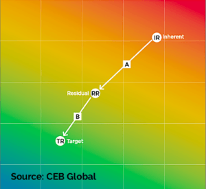
- Demonstrate the effectiveness of risk mitigation plans by including inherent and residual risks. Illustrate reductions in risk exposure based on mitigation and internal controls.
- Differentiate zones of acceptable and unacceptable risk exposure on the heat map.
- Display changes over time by demonstrating movements in risk exposure value.
- Establish risk reduction targets by inserting desired risk levels that can instigate conversations about specific mitigation activities.
- If possible, filter the risk assessment data to show different perspectives across the organization.
Source: CEB Global
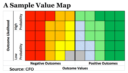 John Bugalla of ERM Insights and James Kallman, a finance professor at St. Edwards University in Austin, Texas, suggest an additional tip in an article in CFO magazine: include quadrants for favorable outcomes too. The map, which they call a value map, has a side for opportunities in addition to the threats. “Because threats and opportunities are two sides of the same coin, a value map also has two sides,” they write in the article.
Getting Lost Along the Way
There are some limitations, of course, to using a heat map. The biggest is that it provides a fairly simplified view of the overall risk picture, rather than a comprehensive cataloging of risk, that can be found in the risk register. The intention is to provide more of an “at a glance” view of risk in the organization than to be the guiding tool for managing risk.
In his book “World-Class Risk Management,” Marks identifies some important drawbacks and problems with using risk heat maps:
1: It is a point-in-time report: “When management and the board rely on the review of a report that purports to show the top risks to the organization and their condition, unless they are reviewing a dynamically changing report (such as a dashboard on a tablet), they are reviewing information that is out of date,” Marks writes in his book.
2: It is not a complete picture: According to Marks, this point goes hand-in-hand with point one. It can never be a comprehensive view of all risks, especially since risks change at every decision and at large companies the full risk landscape likely includes risks too numerous to plot on a two-dimensional page. And, of course, it doesn’t portray the risks that haven’t been or can’t be identified.
3: It doesn’t always identify the risks that need attention: “Just because a risk rates ‘high’ because the likelihood of a significant impact is assessed as high doesn’t mean that action is required by senior management, or that significant attention should be paid by the board. They may just be risks that are ‘inherent’ in the organization and its business model, or risks that the organization has chosen to take to satisfy its objectives and to create value for its stakeholders and shareholders,” Marks writes.
4: It only shows impact and likelihood: Risk heat maps can capture more complexity, such as the change over time and residual vs. target risk profile, but for the most part, most risk heat maps show impact and likelihood. Adding too much more and they start to loose the “at a glance” picture they are intended to give.
5: The assessment of impact and likelihood may not be reliable: Another drawback to risk heat maps is that they don’t immediately show the source of the information and data, including how the likelihood and impact scores were determined. They could, of course, be wrong, but when they are there in red and green, it may impart a certain level of authority that may not be reflected in the actual work that went into scoring the risks.
6: It doesn’t show whether objectives are in jeopardy: “It is very important to produce and review a report that highlights when the total effect of a risk source, considering all affected objectives, is beyond acceptable levels,” writes Marks. “While it may not significantly affect a single objective, the aggregated effect on the organization may merit the attention of the executive leadership and the board.”
Go for It!
As Marks points out, no risk heat map is perfect and it certainly shouldn’t be the only or even main tool for making decisions around risk. Bring healthy doses of skepticism, common sense, and critical thinking to your risk-mapping process. Revisit all the components when you are done plotting the risks and make sure they make sense in context of the other components.
Despite the drawbacks, a risk heat map is an excellent tool to communicate the overall risk picture to busy executives. Just be sure to emphasize that it is a high-level representation and line managers and others on the first line of defense should make a habit of drilling down for more information on the risks that most concern them. ![]()
![]()
SIDEBAR: Some Help with Assigning Impact and Likelihood Scores
If you are looking for some added insight on the likelihood and impact of global risks as part of conducting your periodic risk assessment, a new tool from the World Economic Forum may provide some assistance.
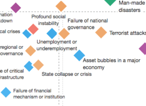
The organization, known for its annual conference in Davos, Switzerland, recently issued a “Global Risks Landscape 2018” report, which highlights the top risks global organizations face and mapped several risks on a likelihood and impact quadrant graph.
Among those risks that World Economic Forum researchers consider to be high in the likelihood of occurring, as well as having the potential for a large impact, are extreme weather events and other natural disasters, failure to address climate change, and cyber-attacks. Other “high-likelihood risks,” but those that would have a lower impact include data fraud or theft, asset bubbles, and illicit trade.
 High Impact, High Likelihood:
-Extreme weather events
-Natural disasters
-Failure to address climate change
-Water Crises
-Cyber-attacks
High Impact, Low Likelihood:
-Weapons of mass destruction
-Food crises
-Spread of infectious diseases
-Critical infrastructure breakdown
Low Impact, High Likelihood:
-Illicit trade
-Failure of urban planning
-Asset bubbles
-Data theft or fraud
Low Impact, Low Likelihood:
-High inflation
-Deflation
-Adverse effects of technology advances
-Energy price shocks
“I remain optimistic about the future, yet the risks to our world are increasing not reducing,” wrote Alison Martin, group chief risk officer at Zurich Insurance Group, in an article on the report. “They are systemic in nature and require a collective will to address them. Unfortunately, this is happening at exactly the time that nationalism, protectionism, and populism are rising, and rules-based multilateralism is declining,” she wrote.
The map groups risks into categories, such as economic, environmental, geopolitical, and technological, and tracks movement in the perception of such risks over time. For the full map and other findings of the report, view the risk landscape chart. —J. McC. ![]()
![]()
Joseph McCafferty is editor & publisher of Internal Audit 360°
Did you enjoy this article? Consider making a small donation to support independent business journalism at Internal Audit 360°. Click Here!
And much thanks to all of those who have already donated. Our success depends on it.
This article is currently causing a bit of a stir on LinkedIn. Doug Hubbard – a very well known author in risk management – brought it to our attention. Doug is very much against the content of this article, as are most people who are into quantitative risk analysis.
The article makes a good summary of these heat maps. But it does not mention that every study ever done on their effectiveness has shown that they are inconsistent, cannot show aggregate exposure (REALLY important), and can be very misleading.
Heat maps are really popular because they are so easy to make, pretty and one barely has to think or know anything about risk. That doesn’t get over the basic problem of them being wrong though.
David, Thanks for you comment. I’m aware of the controversy surrounding the use of risk heat maps and can see how they could be misleading and how they present an incomplete picture of the overall risk landscape. I think most internal auditors understand that they are just one tool to convey an at-a-glance view of risk in an organization. Perhaps I could have used a better headline, but the intention of the article was only to talk about how this particular tool can be created and used. Just about any visualization tool can be accusing of presenting an incomplete or overly simplified view. I’m planning a follow-up that takes a deeper look at the short-comings of risk heat maps and some of the other visual tools that are available to convey the risk picture. I’ll be sure to talk to Doug Hubbard and some of the other risk experts who have told me they oppose the use of risk heat maps.
Perhaps it would be useful to note some better alternatives here in these comments.
Thanks,
Joe